brand design case study
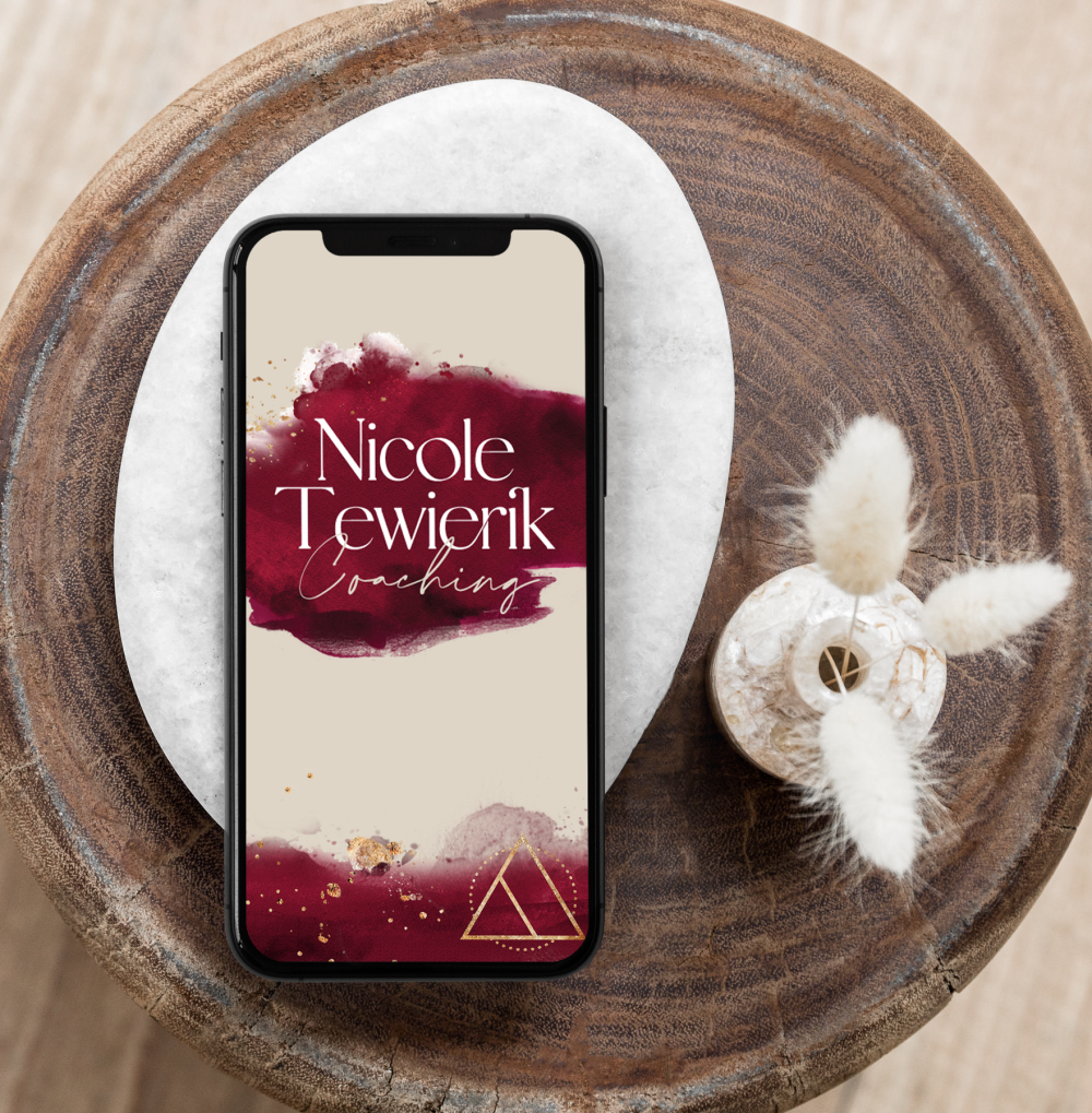
Nicole Tewierik Coaching
Previous Brand

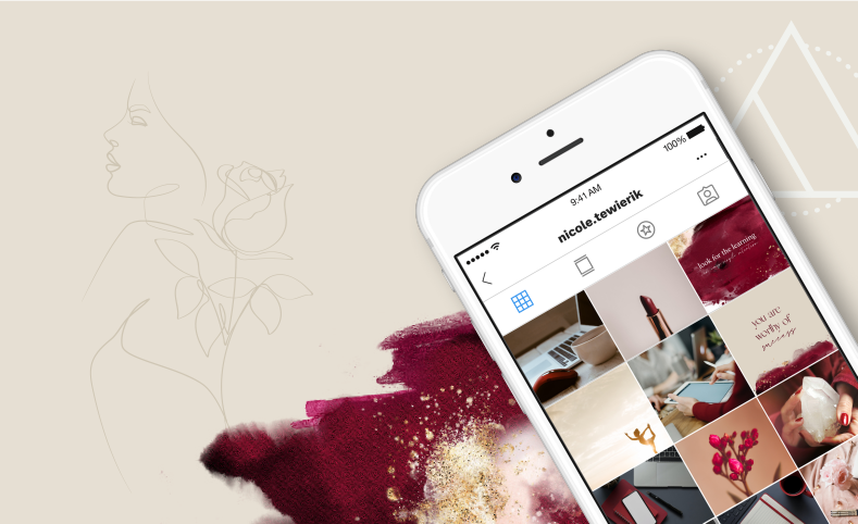
Full Rebrand | Social Media Templates | Proposal Templates
Nicole reached out at a time when her business offering was evolving, and she wanted her brand to evolve with her… to be authentic and less similar to other coaching brands. Her brief was earthy, connected, feminine and deep- a brand that will support the different offers she planned to put out in the future.
Nicole’s business is a balance between soul and energetic alignment, fused with business strategy. She explores the potential of stepping into your feminine power and gaining the confidence to succeed in business to create a life of fulfillment, freedom and control.


Feminine Empowering Alignment
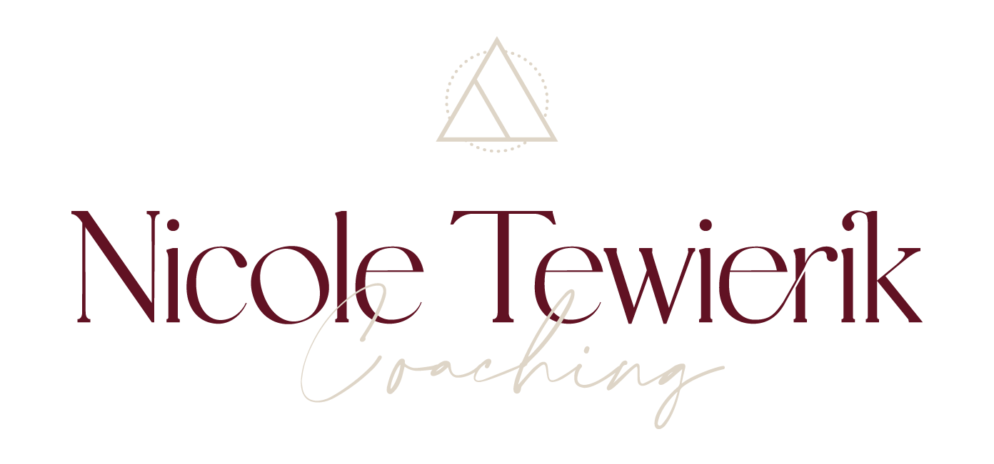

For the Nicole Tewierik brand, I developed a brand mark that includes a triangle.
Triangles are a symbol of balance: in various spiritual and mystical traditions, the triangle can represent balance and harmony. It’s often seen as a symbol of the trinity, which can have different meanings, such as mind, body, and spirit,
or past, present, and future.
This particular triangle with the interior line is a symbol of transformation, and aligns perfectly with the brand values.
SUB BRANDS

Let's Get Started
Nibh enim interdum elit, at consequat nune nibh luctus augue. Vivamus eges condin tumest massa id tincidunt. In idjut leo. Dons quam tortor, varius sit amet massa a mode eget tortor ut est accumsan congue si amet.

Lately From the Blog
I can totally nerd out over a useful business tool, and anything that helps me organise and run my business (and make my life easier) is a must have!
Are you Ready To Work Together?
Dolor sit amet ipsum varius, ut tempor augue pretium. Fusce est magna, eleifend et enim sit amet.
